Audience
Directed at Ohio-based individuals looking for a health insurance solution. The target audience would also value local, individual businesses.
Purpose/Intention
Represent the company's caring and independent values. Distinguish OhioBytes Insurance from other, more corporate options.
Sketches
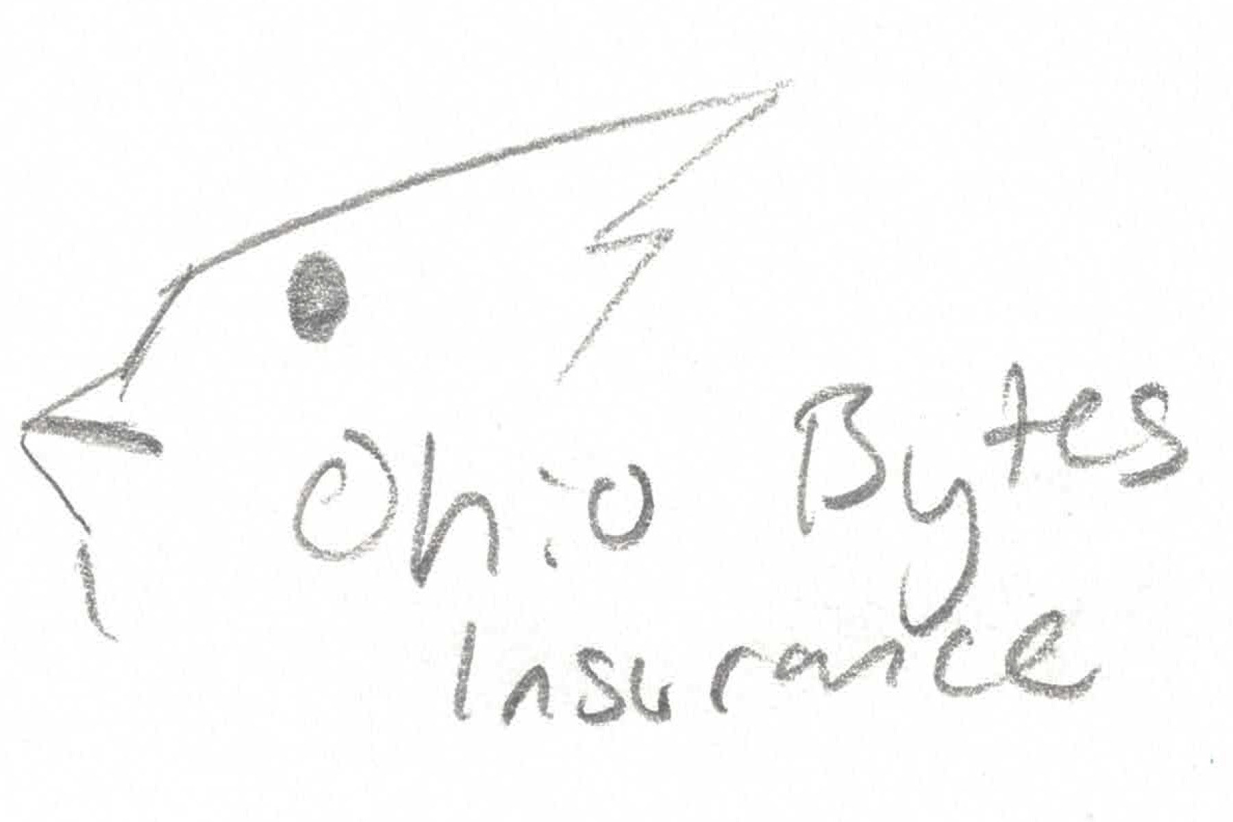
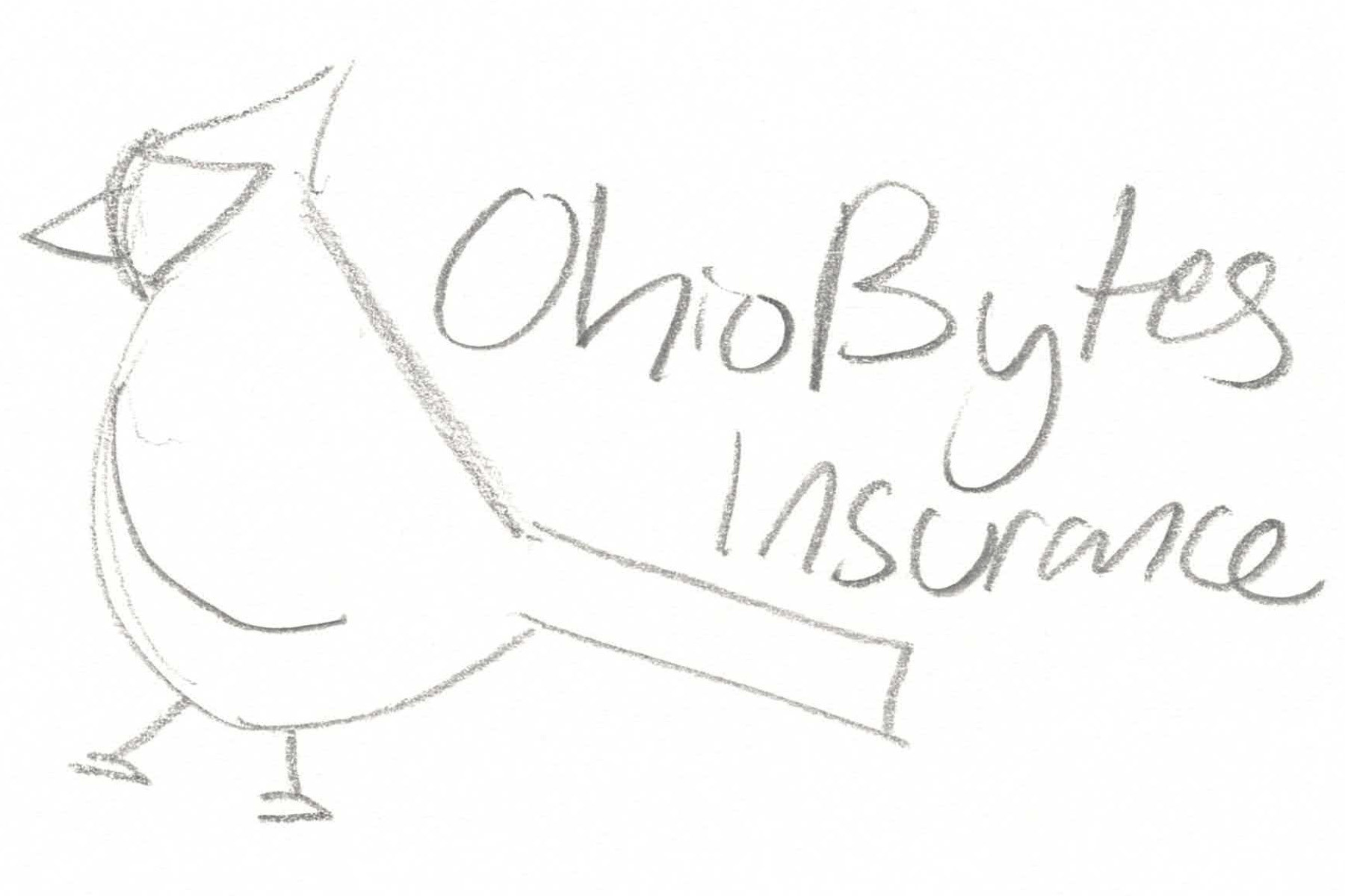
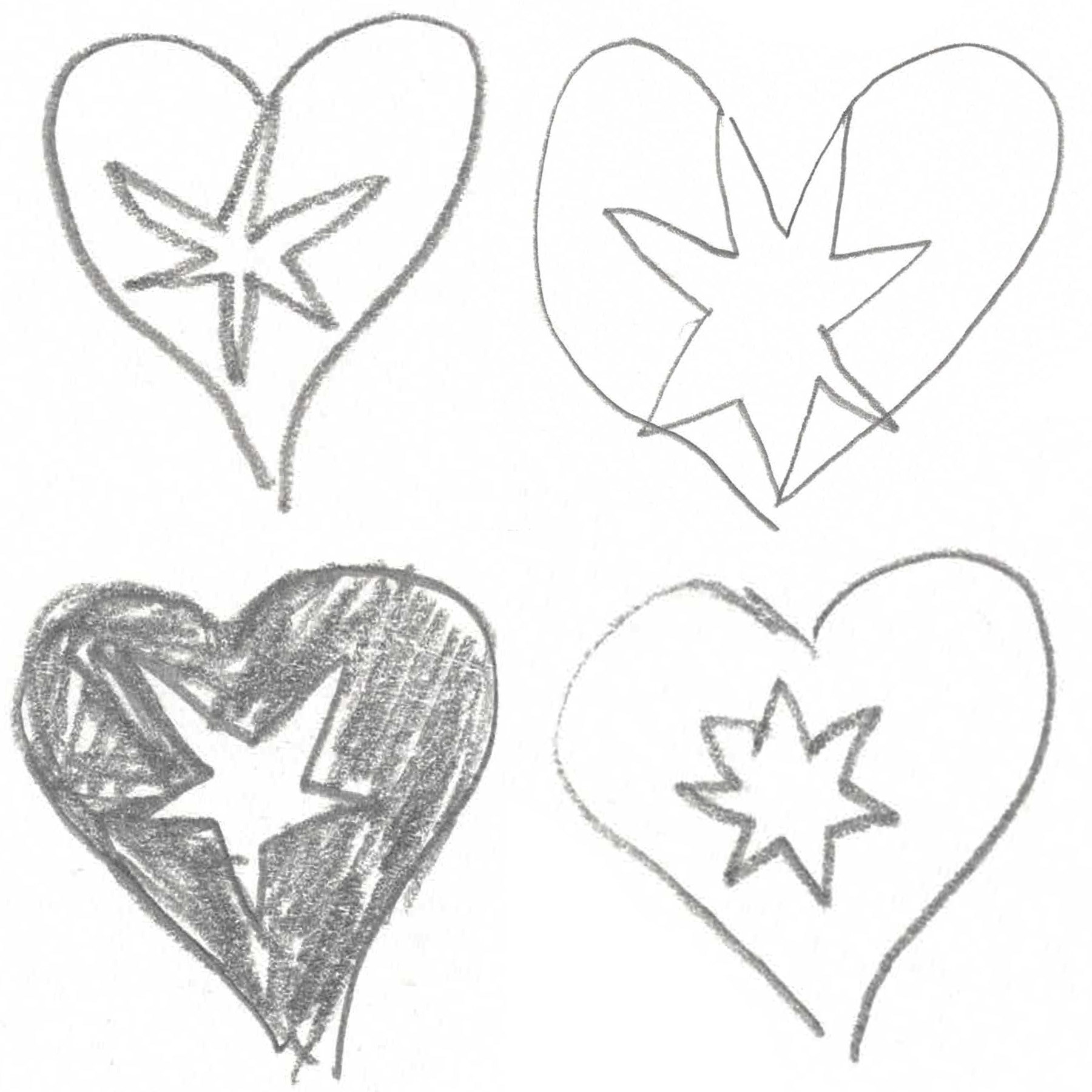
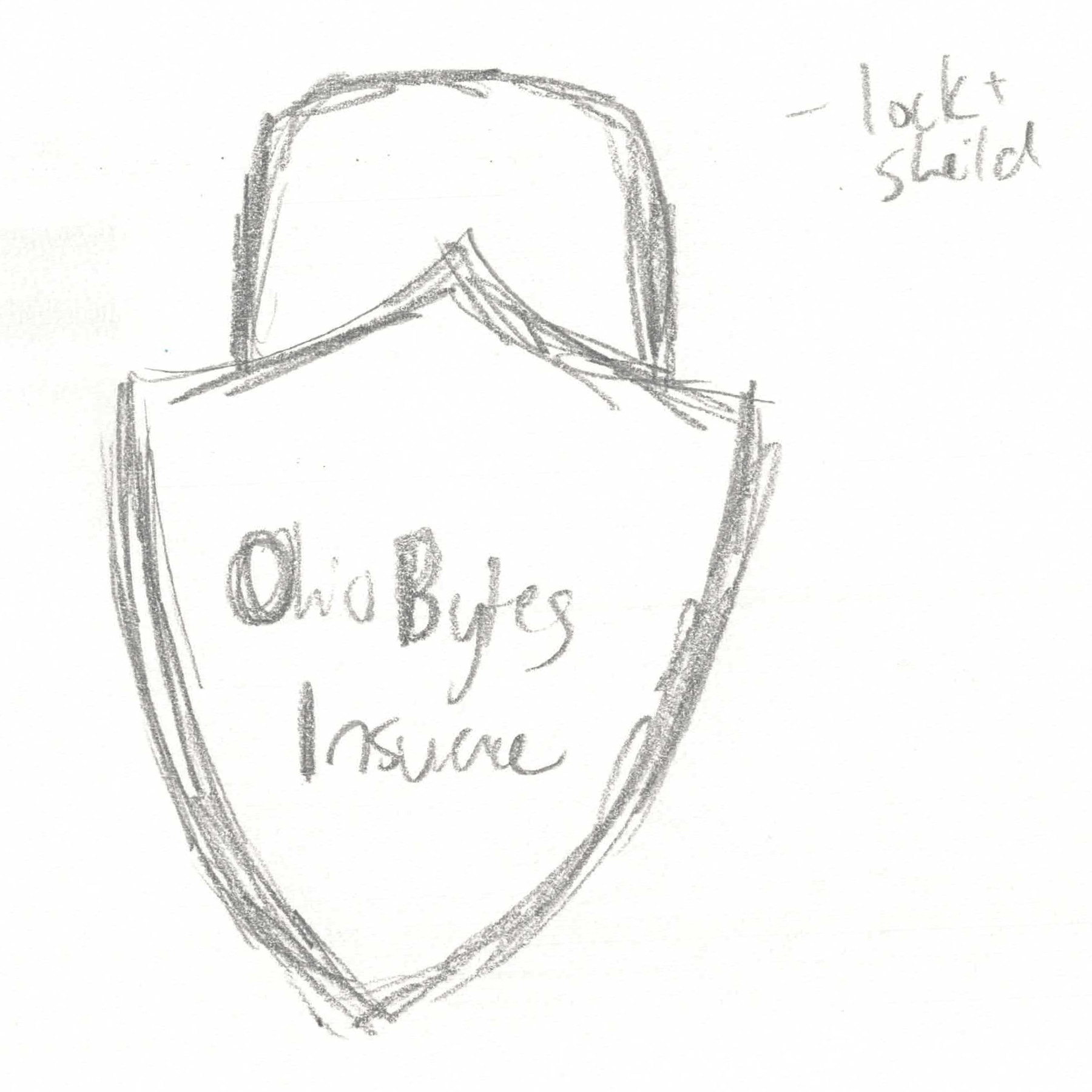
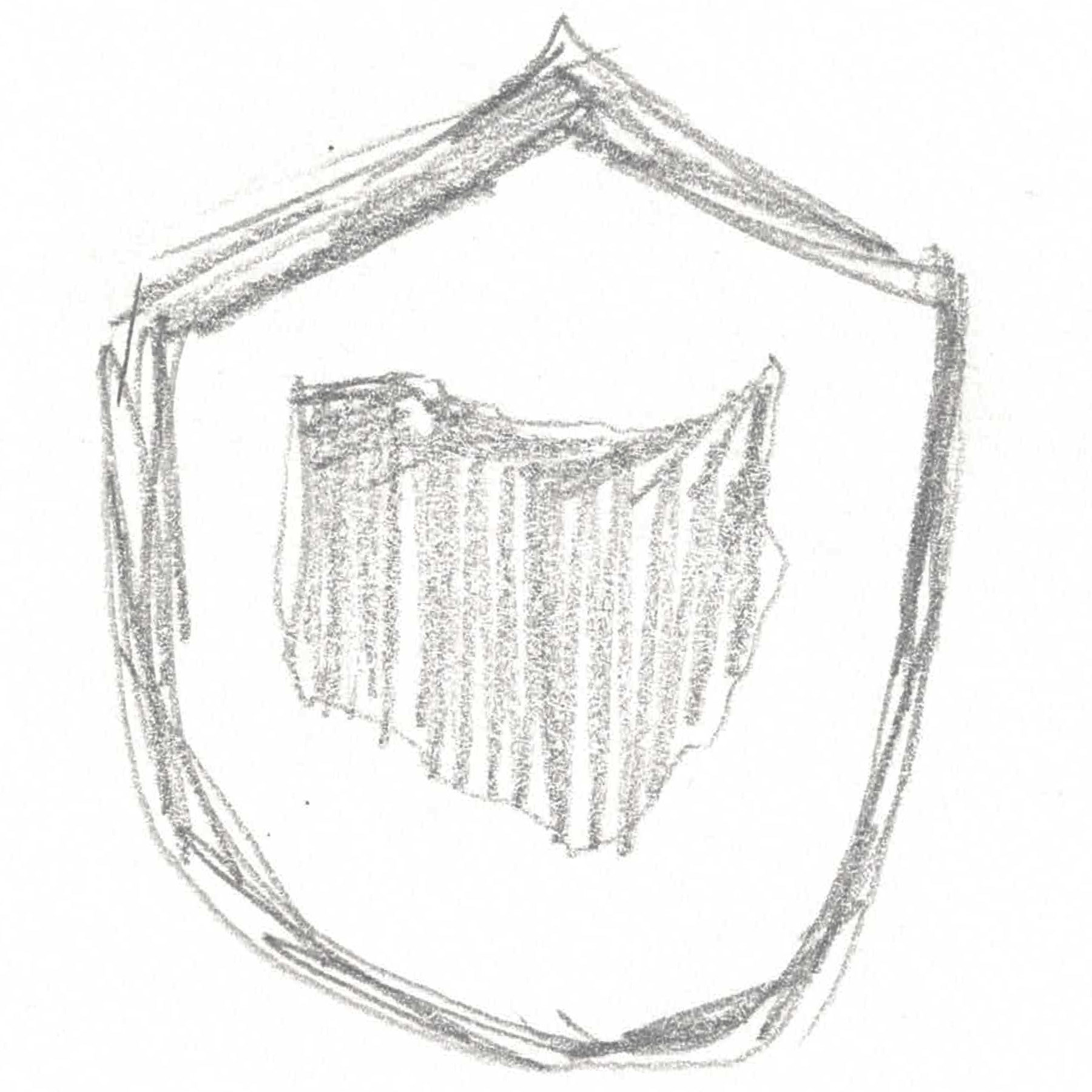
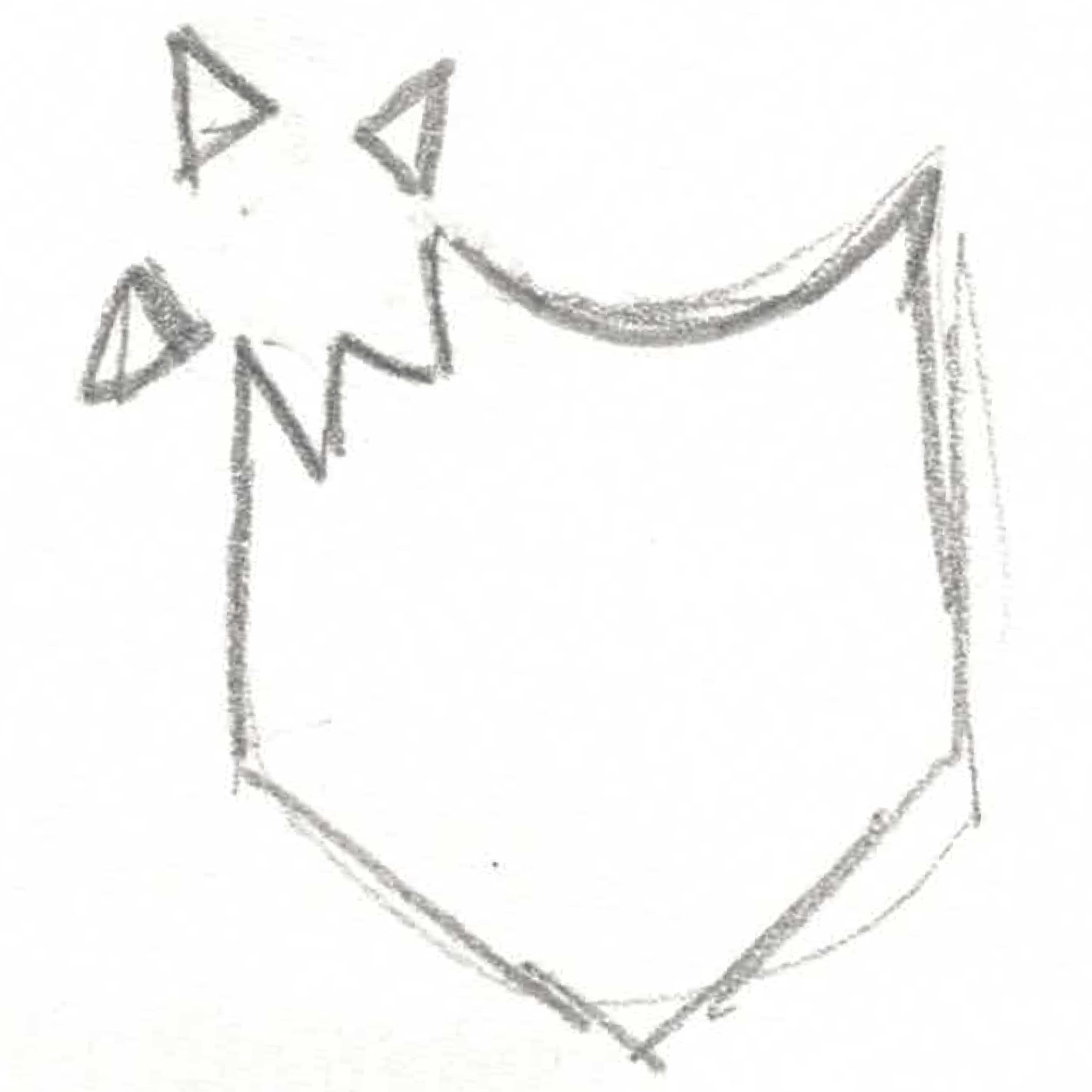
Some were inspired by Ohio imagery, like the state outline and state bird. I also drew on imagery of protection to connect to the ethos of the insurance company.
Iteration
I created three logos based on sketches, then paired them with the text. Colors that complemented the designs were added.
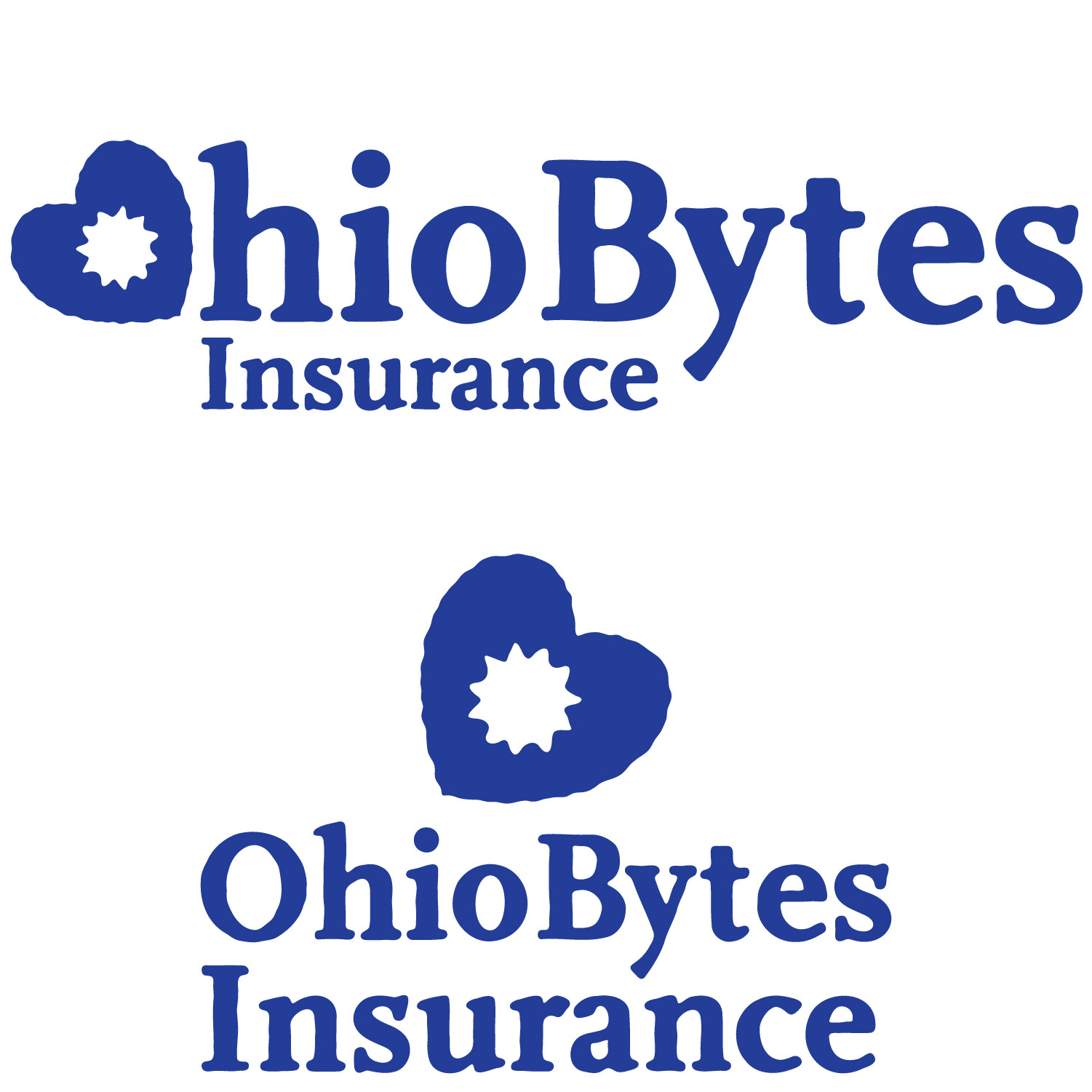
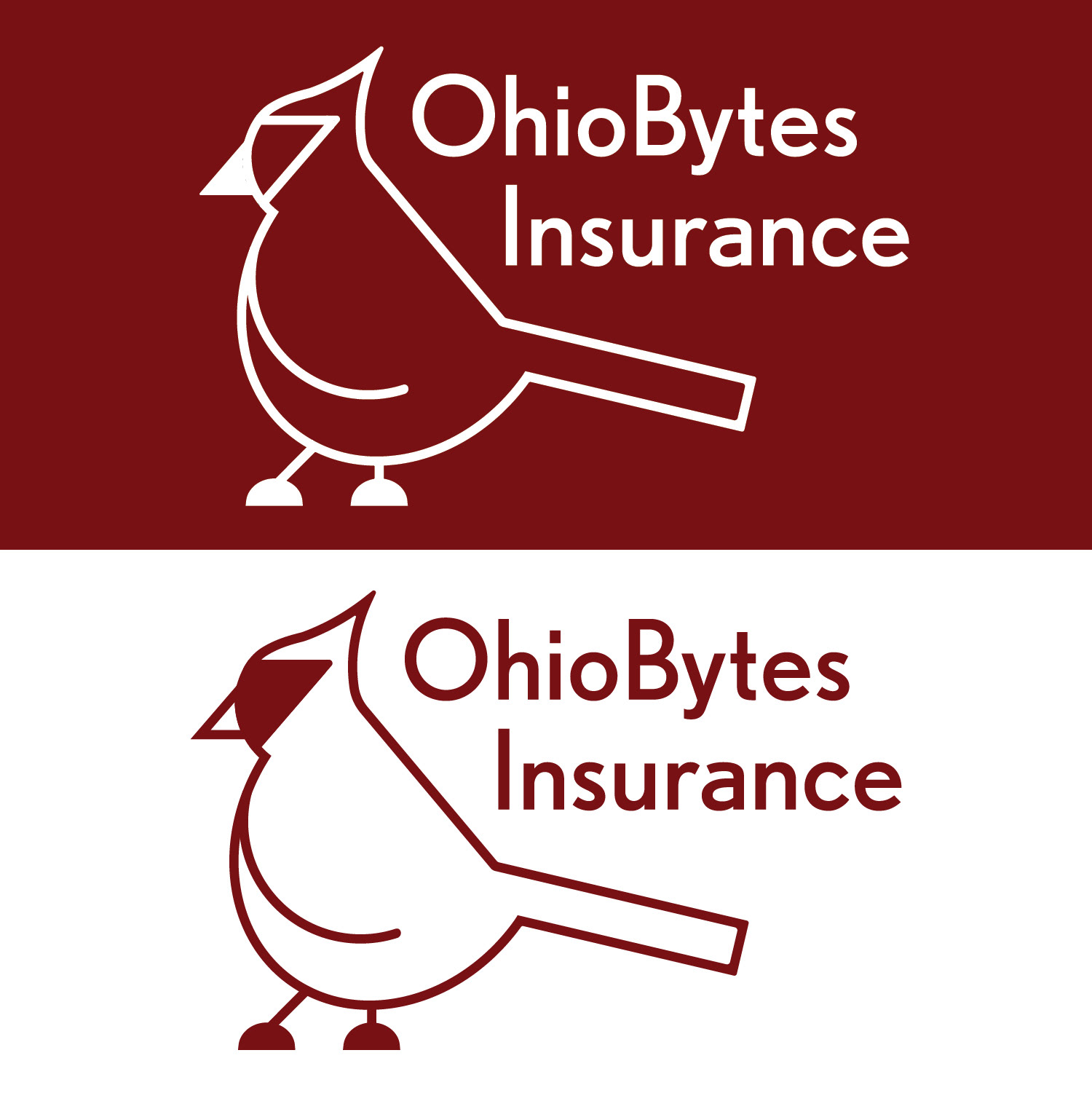
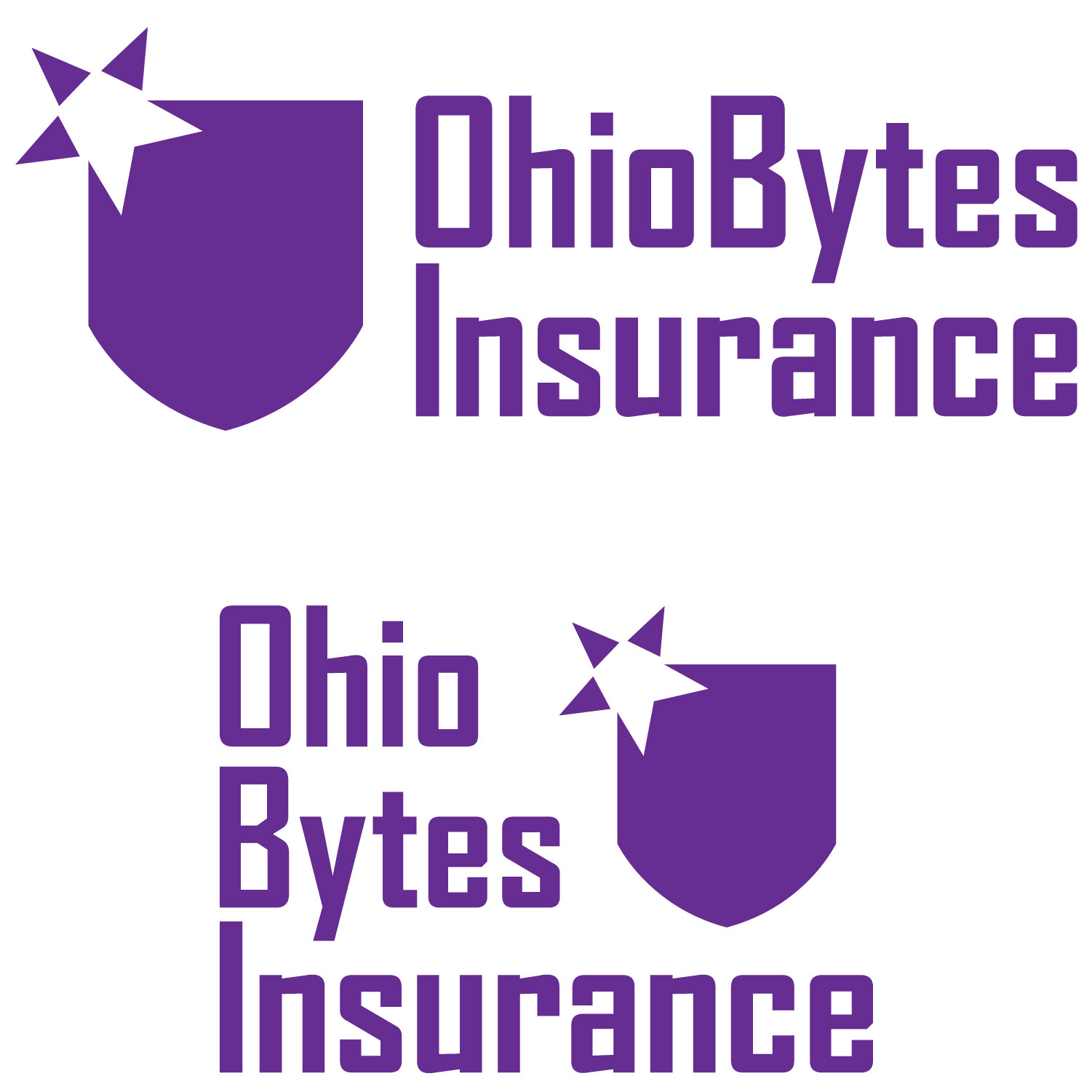
Color Exploration
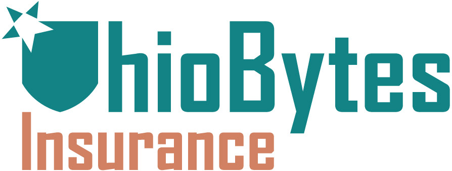
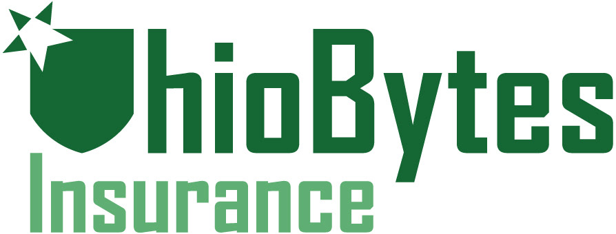
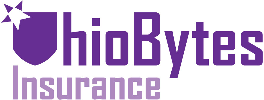
During iteration, I used purple in the logo to show the company's uniqueness and help it stand out, but I also explored other hue options. A secondary color was added to "Insurance" to distinguish it and add variation, but all aspects can also be simplified to the same color if needed.
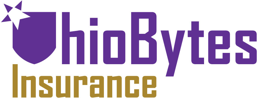
Final
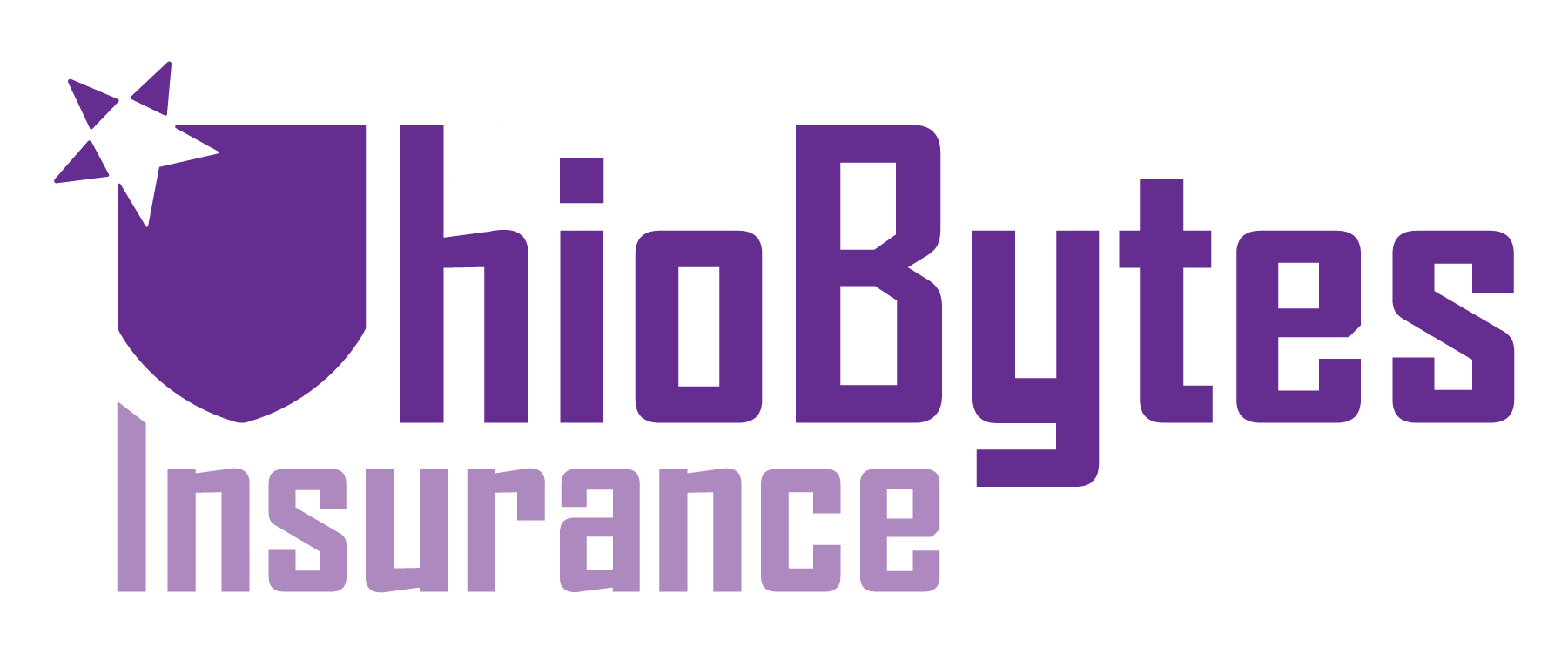
Several corners of the logo were rounded to subtly increase friendliness. The "y" was adjusted for cohesion. I worked to improve the position of "Insurance" relative to the rest of the design, which led to the top of the "I" becoming slanted.

Logo alone
SIgnature
Application

Business Card
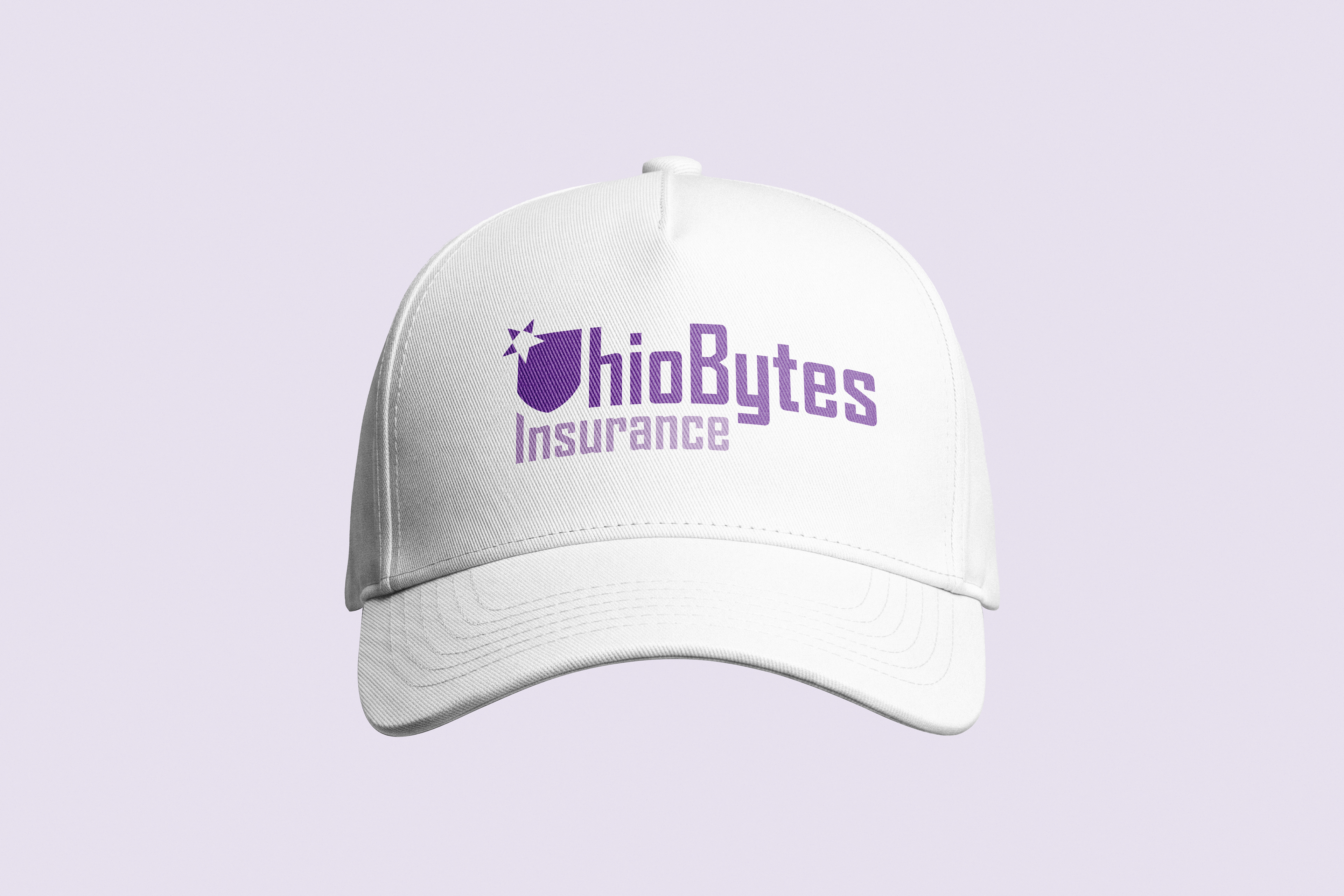
Hat
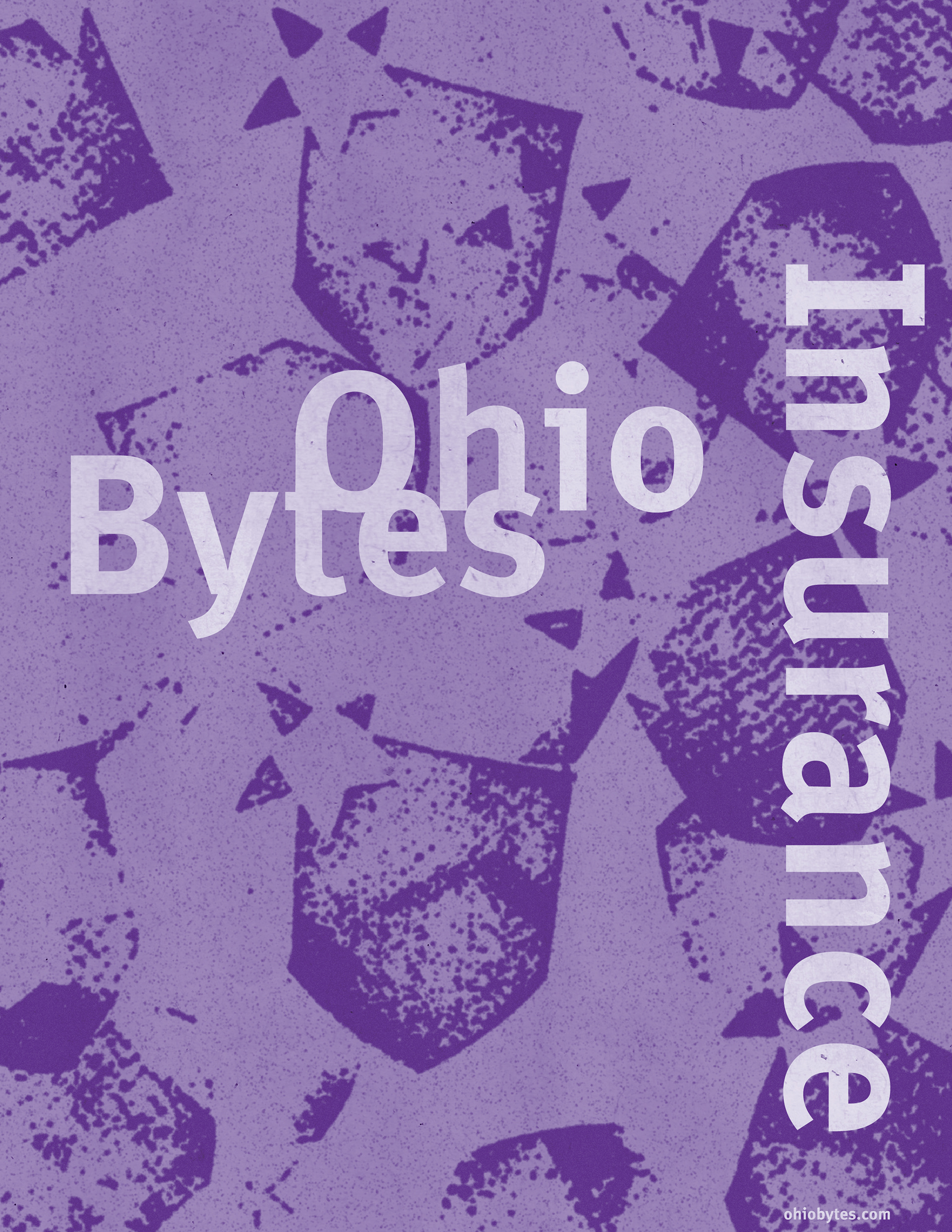
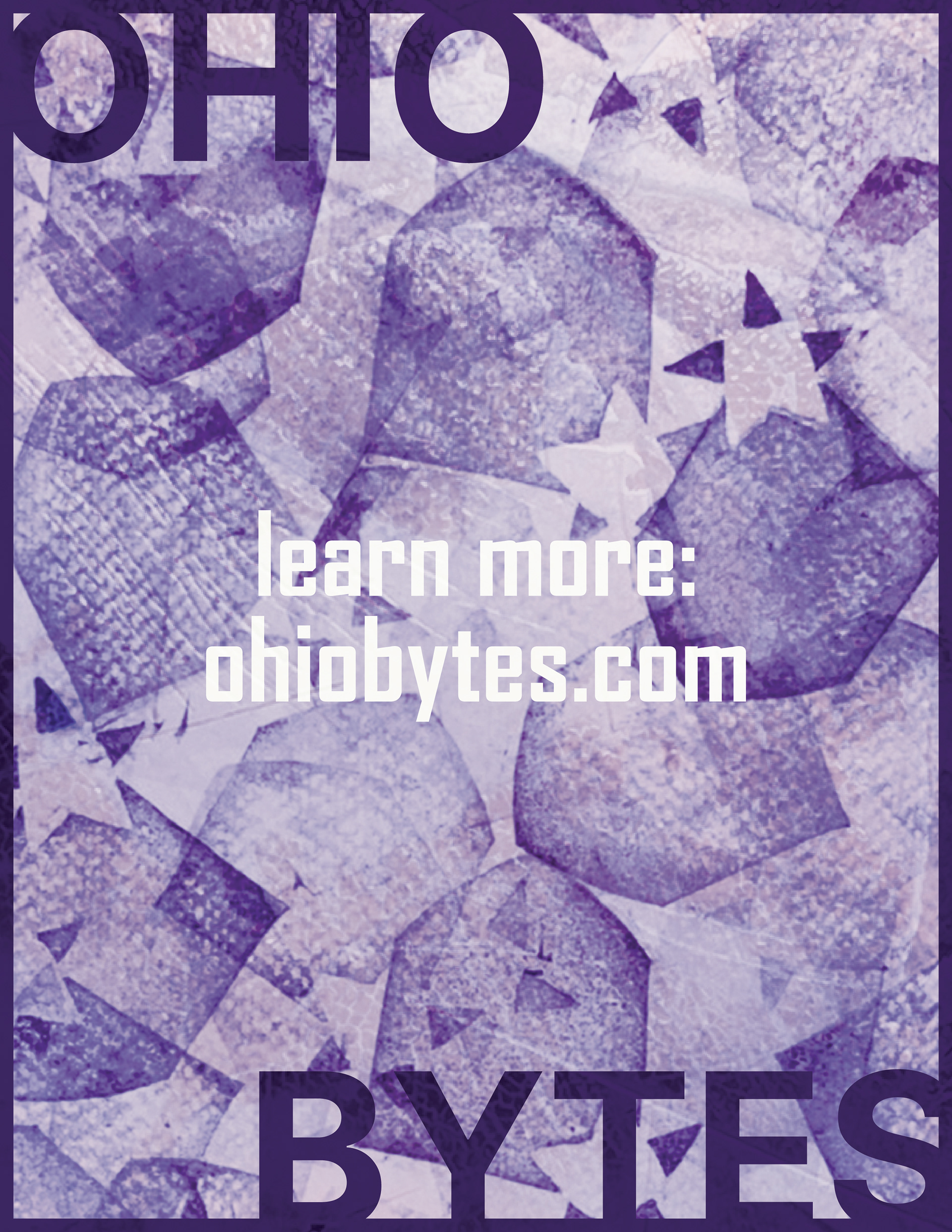
Poster exploration
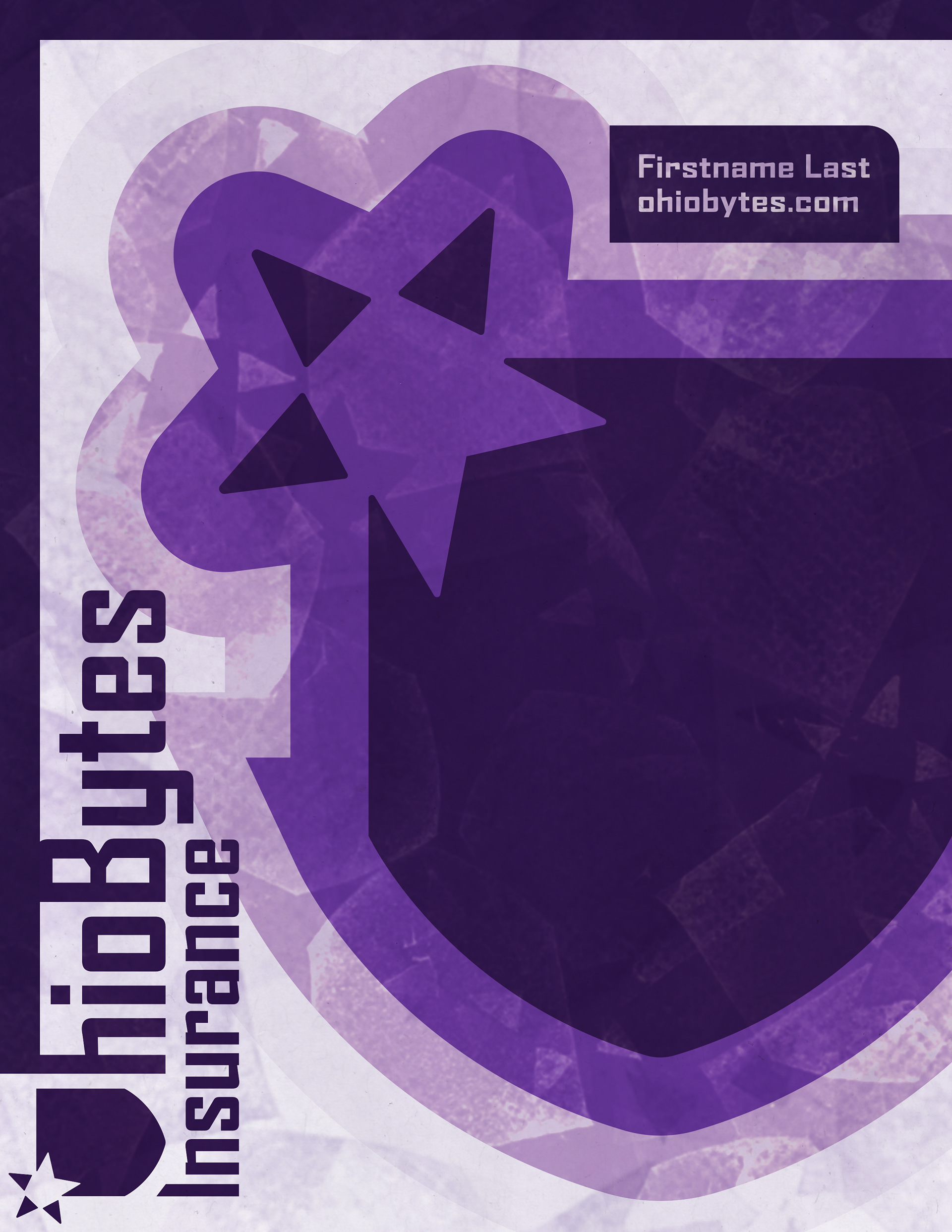
I decided to design a poster to explore the possibilities of the current branding. I carved a stamp of the logo and then scanned papers with ink stamps. I used this as a base to add imperfections and interest to my poster designs.
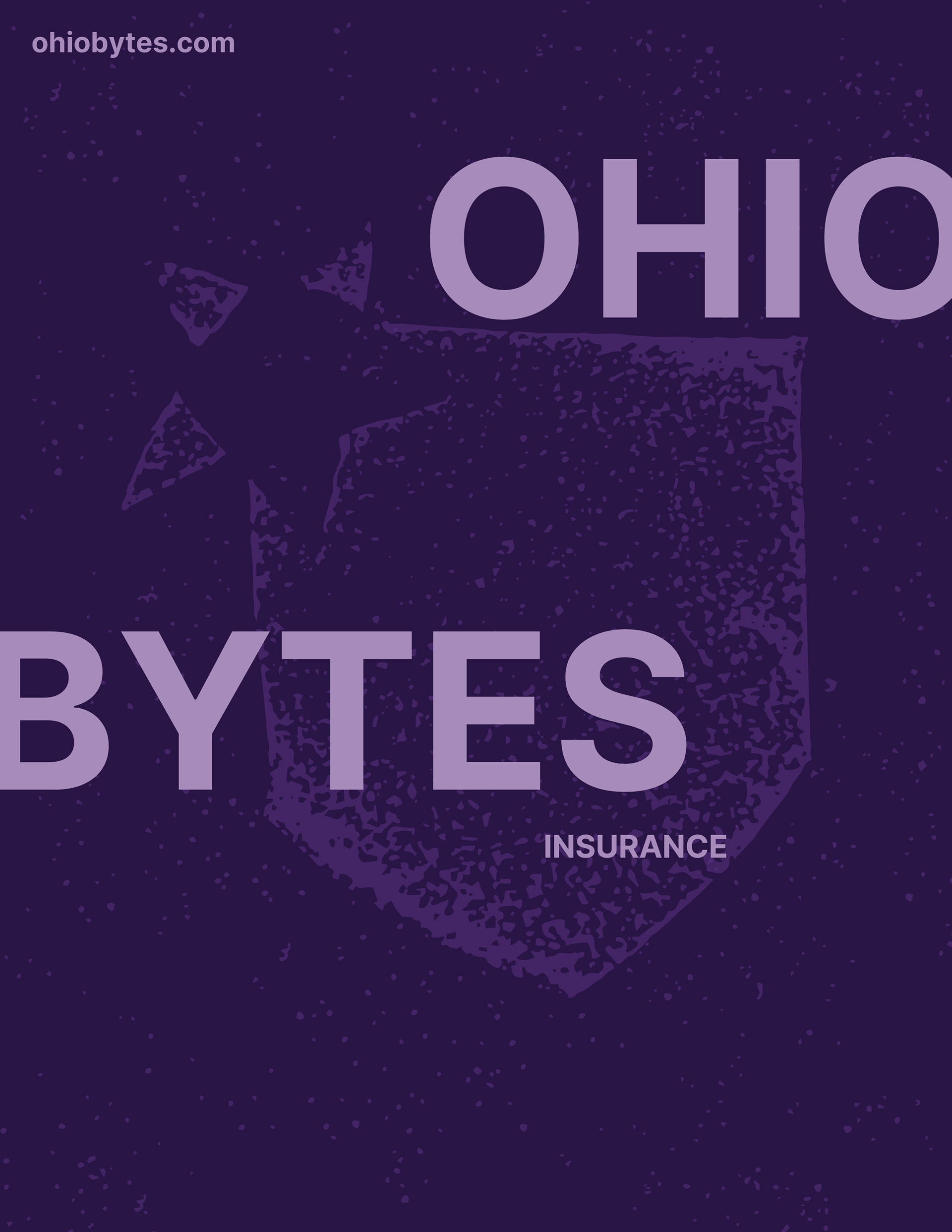
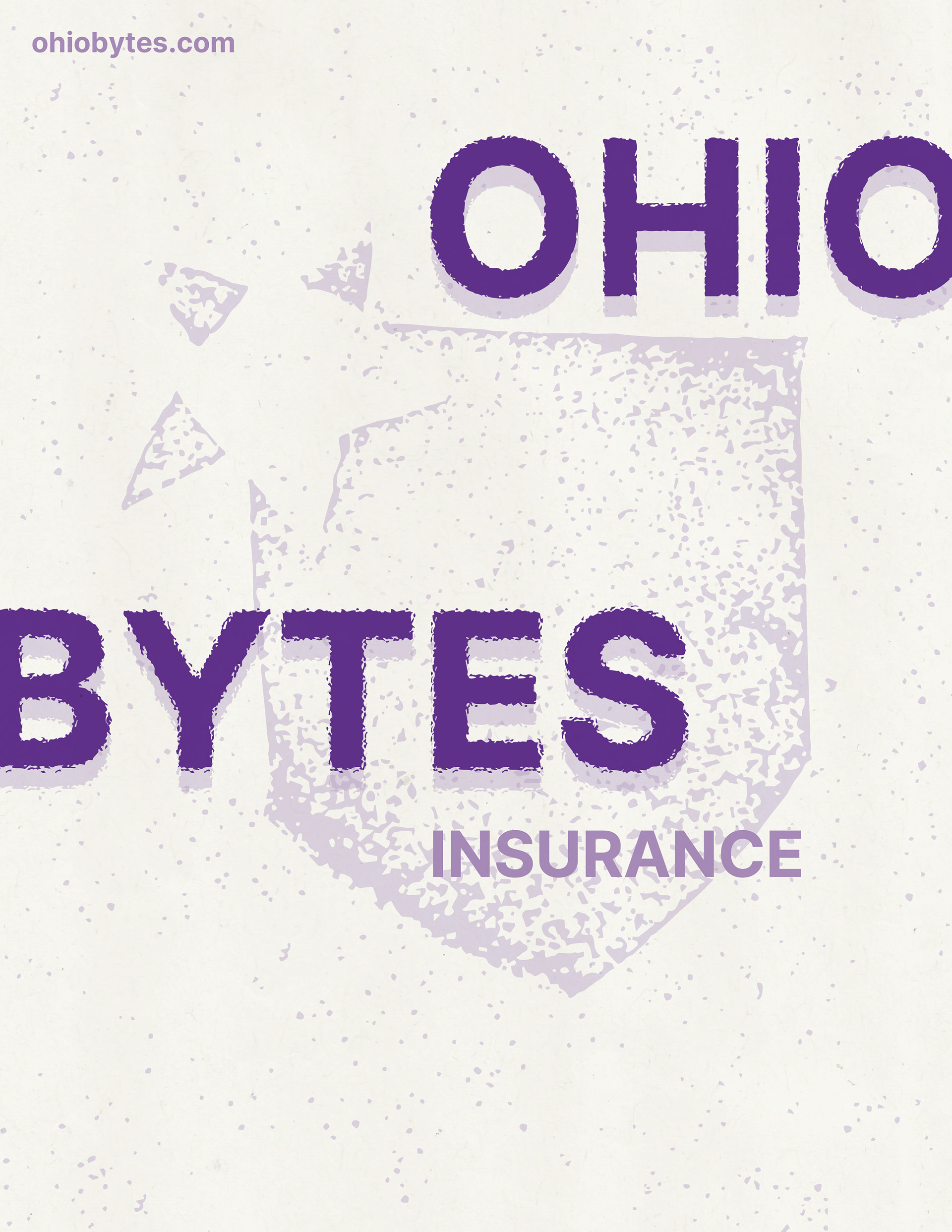
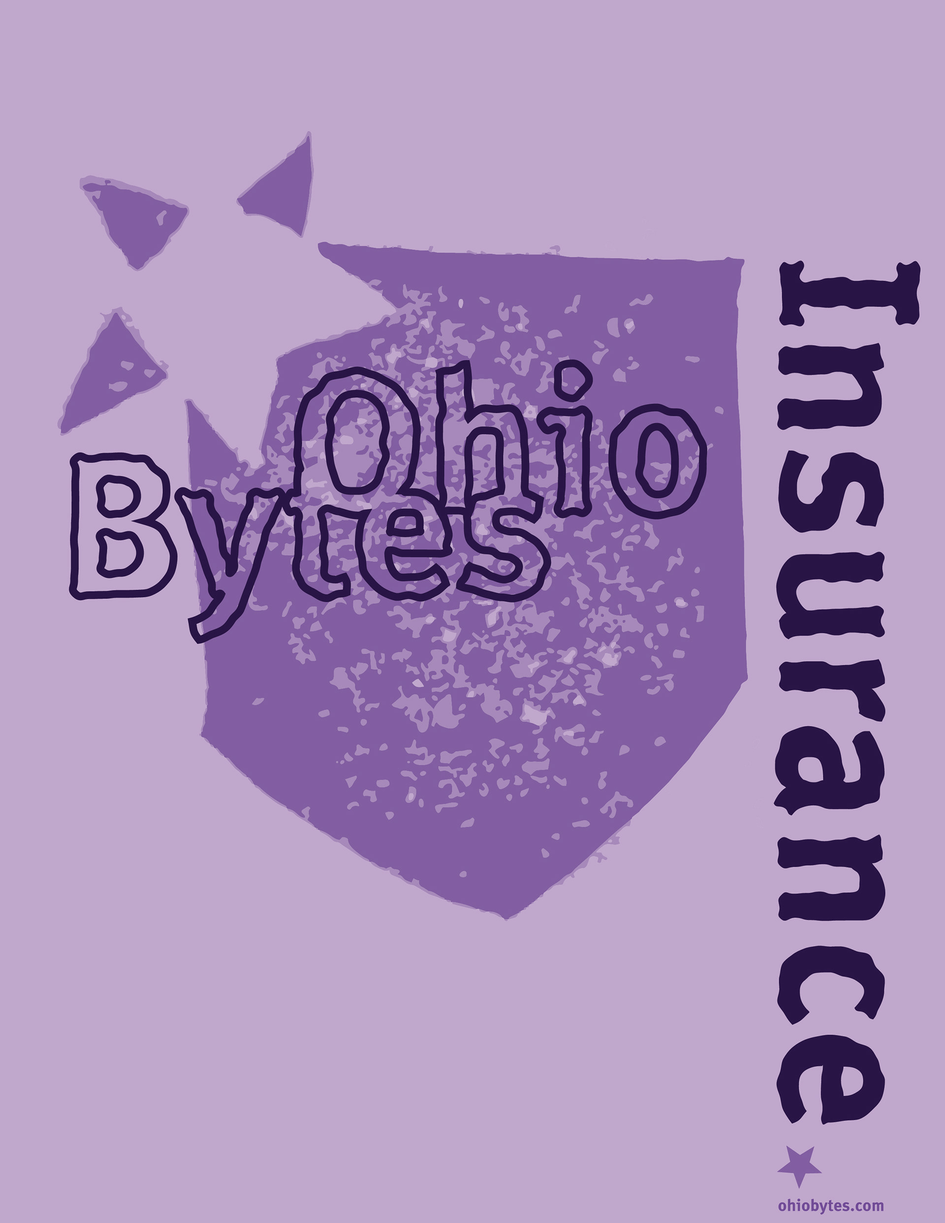
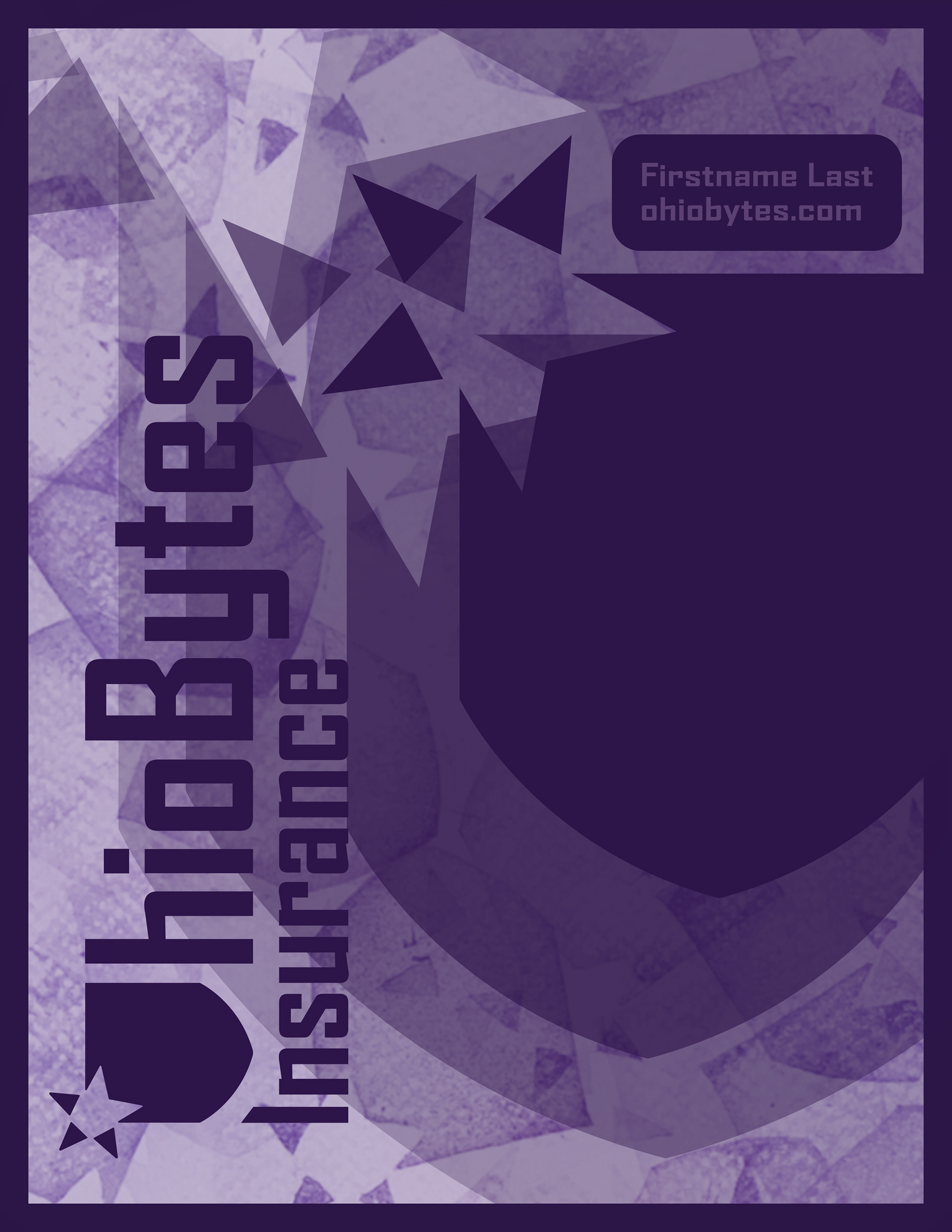
Final Poster
Mostly relying on my final iteration, I created a poster that included the logo, signature, and stamp texture. I worked to eliminate awkwardness in the composition